AI chat with me
Amir Afroozan

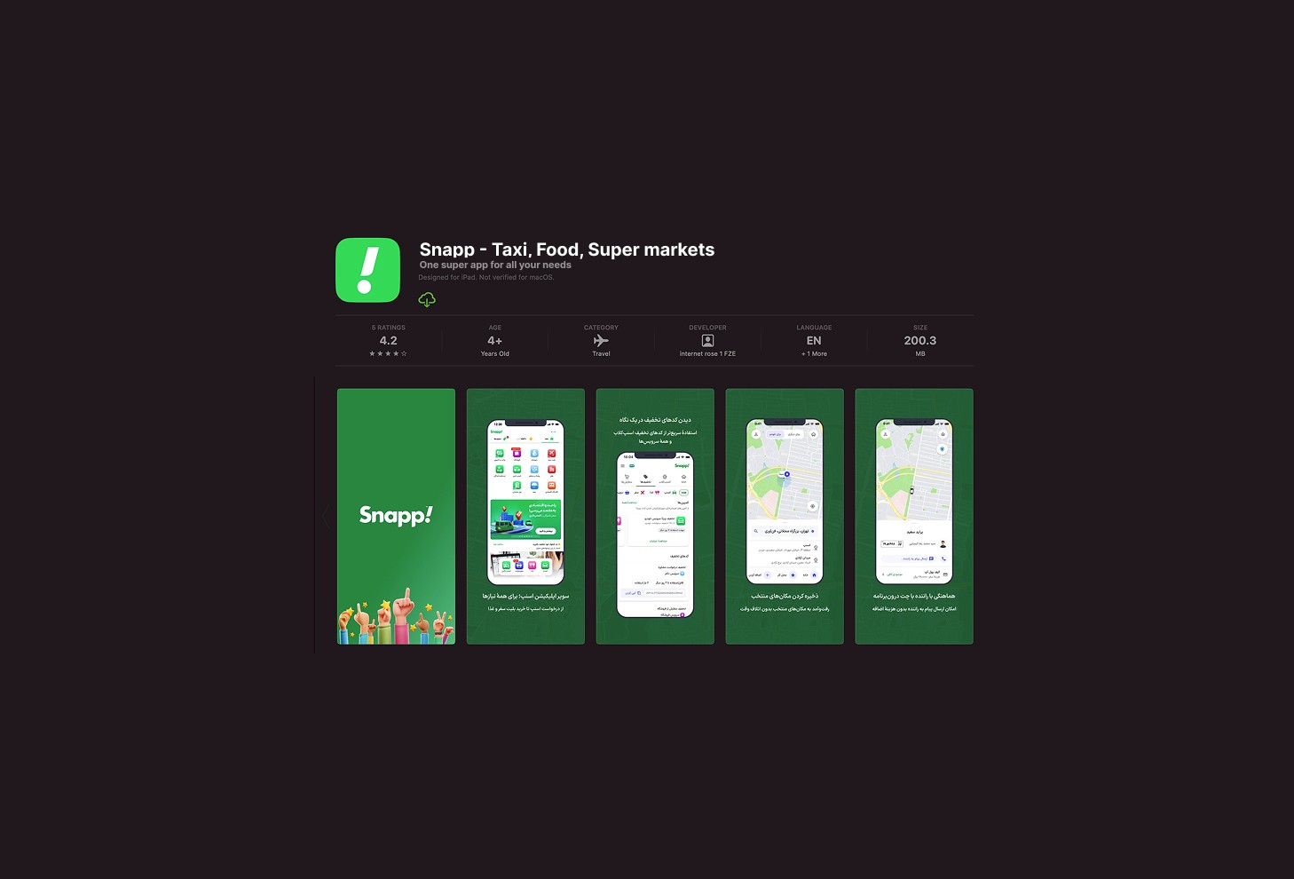
The initiative to redesign the Snapp iOS app stemmed from the realization that its user interface was significantly outdated compared to our recently improved Android version. While a full redesign wasn’t feasible given our limited timeframe, we identified key enhancements that would align the iOS app with Apple’s Human Interface Guidelines (HIG) to provide a more seamless and intuitive experience for our users. This "Soft Redesign" was an experience optimization effort — a strategic attempt to make impactful improvements without overhauling the entire interface. As the design owner, I led a team of three designers and one UX writer, collaborating with a design system designer and a product owner to implement these changes effectively.
Client:
Snapp
My Role:
Product Designer
Year:
2021
Service Provided:
Product Design

Problem Statement
Outdated Visual Language:The app’s interface felt inconsistent with iOS conventions, impacting familiarity and ease of use.
Navigation Friction: Certain interactions, particularly in key flows, were clunky or unintuitive.
Limited Adaptability:The app struggled to provide a seamless experience across various iPhone screen sizes.
Objectives
Our primary goal was to identify design changes that could deliver immediate improvements without extensive development effort.We focused on:
Enhancing navigation and accessibility.
Aligning the visual language with iOS standards.
Improving consistency across the app’s key screens and flows.
Design Process
Our design process started by evaluating the existing iOS design and identifying areas that felt outdated or inconsistent with iOS standards. With limited time available, we prioritized changes that would offer the greatest impact without extensive development effort. By focusing on key usability improvements, we aimed to enhance the user experience in a meaningful way. Once we identified these opportunities, we implemented the changes strategically, ensuring each adjustment aligned with iOS design principles. To maintain consistency, we adopted a QA-driven approach to UX writing, leveraging content from our Android app as a baseline while refining key areas to better suit iOS users. Throughout the process, we collaborated closely with developers, the design system team, and product stakeholders to ensure our changes aligned with technical requirements and business goals.
Key Design Decisions
Stacked Buttons
We replaced side-by-side button arrangements with stacked buttons to improve navigation and accessibility. and alignment with HIGBottom Sheets
We introduced bottom sheets to leverage iOS's gesture-based interactions, improving usability for key flows.Curved Corners
We adopted curved corners for UI elements to match Apple’s visual language and improve aesthetic appeal.Resolution and Layout Adjustments
We adjusted screen resolutions and layouts to ensure optimal presentation across all iPhone models, resolving previous inconsistencies.

Rationale Behind Key Decisions
Stacked Buttons:
Improved thumb reach and one-handed usability.
Provided clearer visual hierarchy, reducing confusion.
Ensured scalability across various iPhone screen sizes.

Bottom Sheets:
Enhanced navigation with gesture-based interactions.
Allowed content preview without leaving the current screen.
Improved alignment with common iOS interaction patterns.

Curved Corners:
Enhanced visual consistency with iOS design language.
Created a smoother, more modern aesthetic.
Resolution and Layout Adjustments:
Ensured optimal content presentation across all iPhone models.
Improved consistency with Apple’s device specifications.

Challenges
Here we can talk about alligments of road map and workflow!
Reflections
This experience taught me the importance of prioritizing impactful changes, especially when working under tight constraints. Leveraging established design principles and focusing on achievable improvements enabled us to deliver meaningful updates without the complexity of a full redesign.
Conclusion
The Snapp iOS "Soft Redesign" exemplifies how thoughtful, strategic decisions can create a more intuitive and native-feeling user experience. By focusing on alignment with iOS standards and prioritizing high-impact changes, we successfully enhanced the app’s usability and visual coherence within the project's limitations.
Mission Accomplished!
We rolled out these design changes for a limited percentage of users to monitor the impacts and metrics and evaluate our design decisions. We compared the new data with previous one and figured out there are lots of improvements on Cancellation rate and Conversion rate.