Amir Afroozan
The objective of this case study is to enhance a feature that allows users to schedule rides in advance. This feature, part of a ride-hailing app, aims to increase ride availability for unique destinations during low-supply periods.
Client:
Snapp
My Role:
Product Designer
Year:
2021
Service Provided:
Product Design

Where it all happened
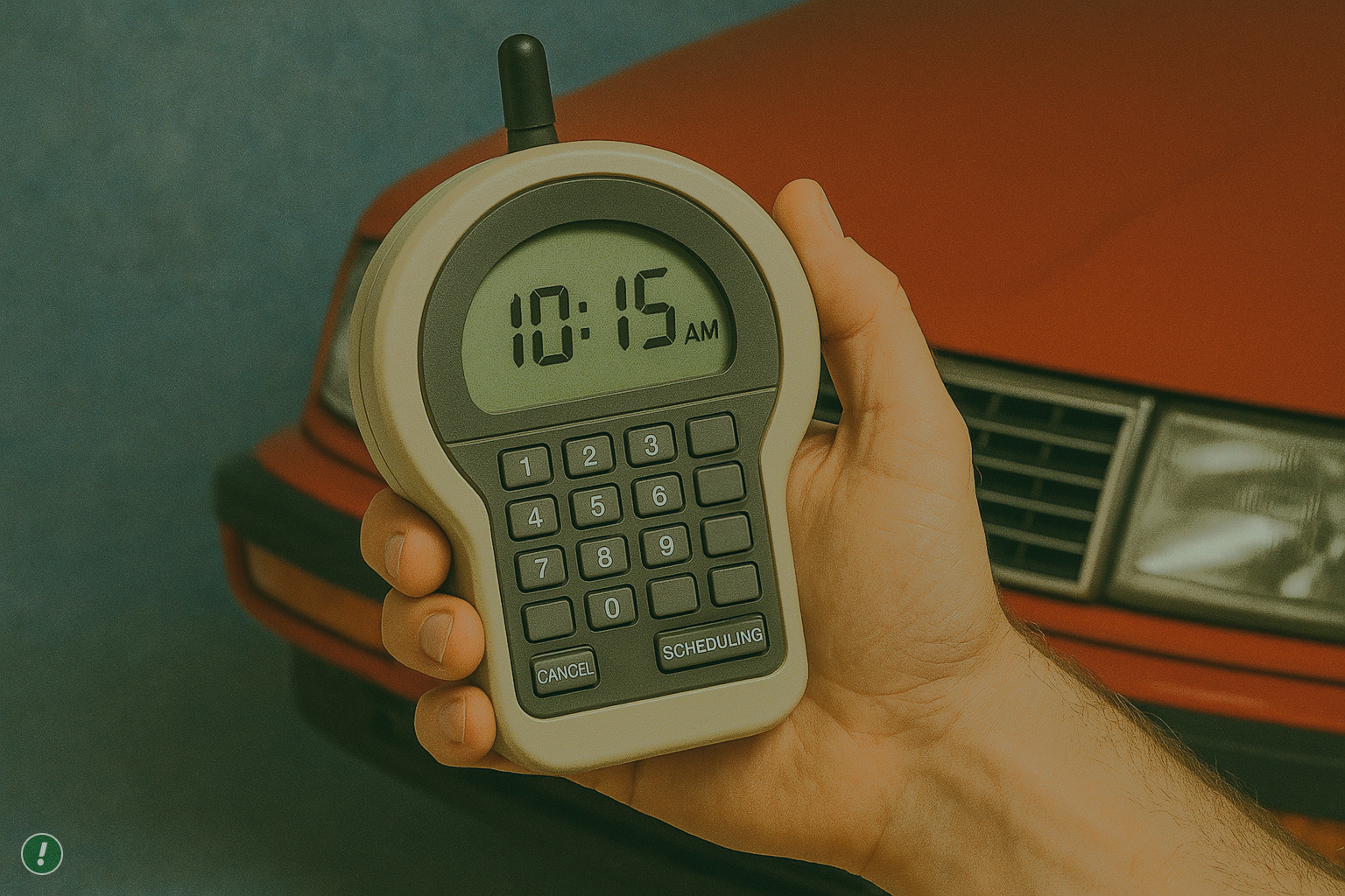
Snapp! is known as the Uber of Iran with more than 2 million rides per day and 60 million users. The company is the largest and fastest-growing internet company in the Middle East. The Scheduled Rides feature allows you to book a ride in advance by selecting your pickup time and offering convenience and peace of mind, especially for important appointments or events. However, user research revealed several challenges and areas for improvement within this feature.
Launched, But Lost
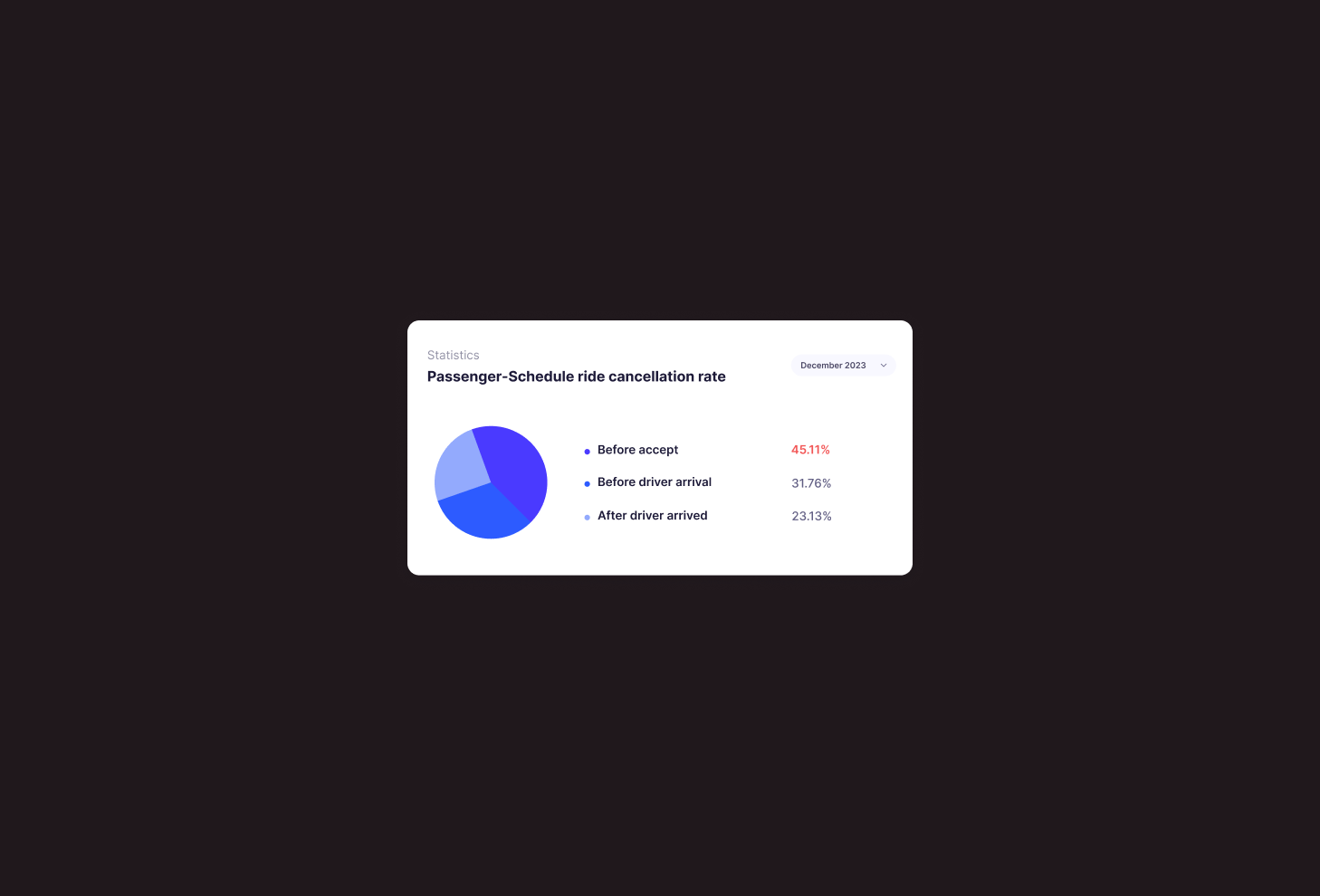
After rolling out this feature, the analysis showed that the cancelation rate was more than 45% before accept by driver which is high. This problem raised from product managers and we decided to understand the underlying reasons for this behavior in order to develop a better solution.
Behind the Cancellations:
What’s Really Happening?
With the help of UX research team, we conducted quantitative online surveys to discover the reasons behind this problem.
Although that the UX research team was responsible for entire research process, We was participate in all the steps from research plan, choosing methods to the final insights. Our research goal was searching for answers to these questions :
1. Can users understand the "Scheduled Ride" feature?
2. What causes passengers to cancel scheduled rides?
Results
This research revealed that there has been a lack of promotion and education regarding the feature, which ultimately leads to user dissatisfaction and cancellation of the service.
1. 40% of the users were unable to understand the purpose of the feature.
2. 22% of the users submit their request out of curiosity!
3. 28% of users didn’t know about the driver arrival or delay terms and conditions.

Benchmarking
With the help of UX research team, we conducted quantitative online surveys to discover the reasons behind this problem.
Although that the UX research team was responsible for entire research process, We was participate in all the steps from research plan, choosing methods to the final insights. Our research goal was searching for answers to these questions :
1. Can users understand the "Scheduled Ride" feature?
2. What causes passengers to cancel scheduled rides?

Wireframes
In the early stages of conceptualizing the improvements, We invited one member from each team include product manager and developer to engage in dynamic brainstorming session. These session were fueled by creativity and collaboration, as we explored various ideas to enhance the user experience and user clarification. Throughout this brainstorming session, sketches played a pivotal role in visualizing my concepts and refining my ideas.

Design Solution
Based on the findings from user research and benchmarking, the following design solutions were implemented :
1. Introducing the feature to users from the first step
Based on one of the UX research findings about lack of clarity and education, We added a tooltip to explain what’s this feature about and increase awareness. We also changed the schedule ride icon (based on benchmarks) and placment where we can have a title for more clarification.
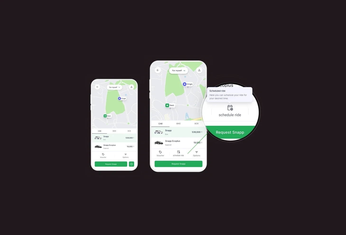
2. Onboarding improvements
We added a related illustration to grab user attention and make this page more enjoyable for user. Based on the fact "Users scan!", We highlight some important key notes with the help of UX writer and using visual hierarchy rather than showing too much text to increase readability. We wanted to make sure users understood the feature very well and reduce the requests out of curiosity.

3. Error prevention on time picker
We have a rule that user can schedule a ride for at least 15 minutes ahead of current time and currently we let user to select the past or wrong time. We checked the error rates in this page on Clarity monitoring tools and find out around 45% of users face an error in this page. So base on the best practices in collaboration with technical team, We decided to show the next possible time to users and prevent users from selecting the wrong time by disabling them.Also We informed user about driver delay average time in this modal because it helps them to select more accurate pickup time.

5. Adding a touchpoint to track upcoming rides
We designed a dedicated touchpoint on the homepage for tracking upcoming scheduled rides. Users can effortlessly access and manage/edit upcoming bookings without navigating through multiple screens. This enhancement simplifies the process of locating scheduled rides and boosting feature find-ability.

Mission Accomplished!
We rolled out these design changes for a limited percentage of users to monitor the impacts and metrics and evaluate our design decisions. We compared the new data with previous one and figured out there are lots of improvements on Cancellation rate and Conversion rate.
